SOLUTION
Self-Organization is the key
Scheduling
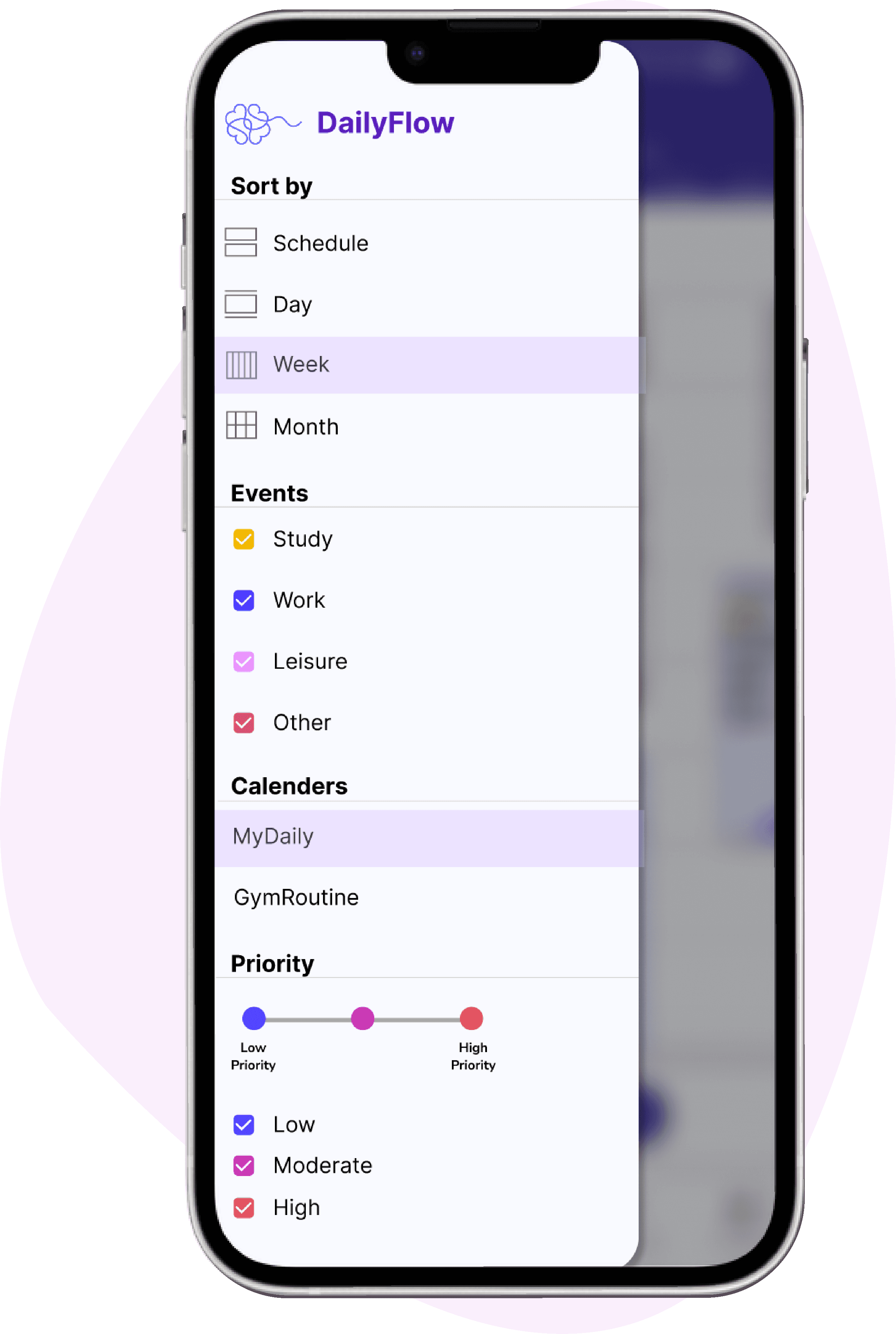
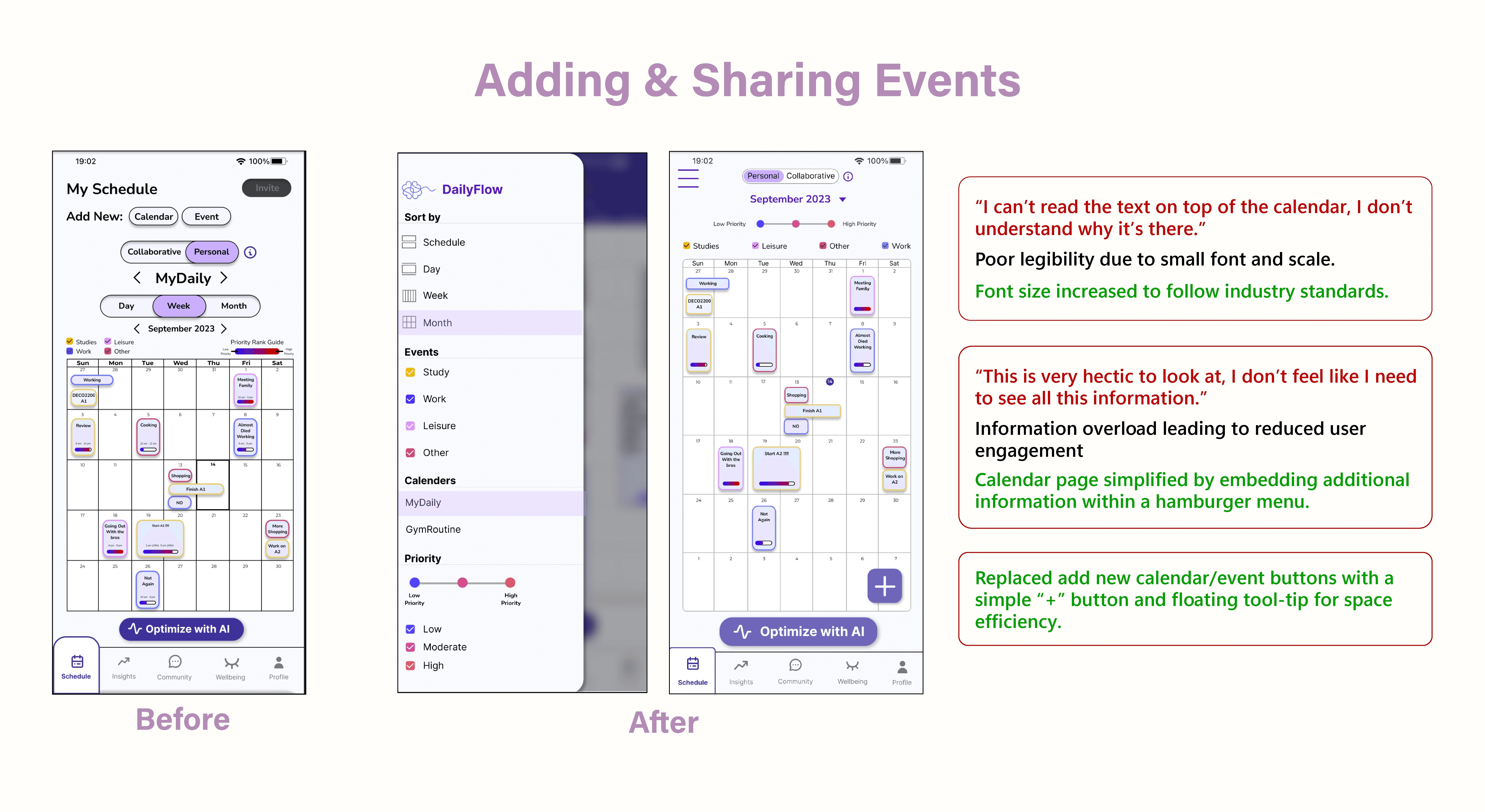
Allows students to look at their daily schedule and visualize the priority of individual events at a glance.
Students can easily add new events to their calendar.
Create new personal or collaborative calendars.
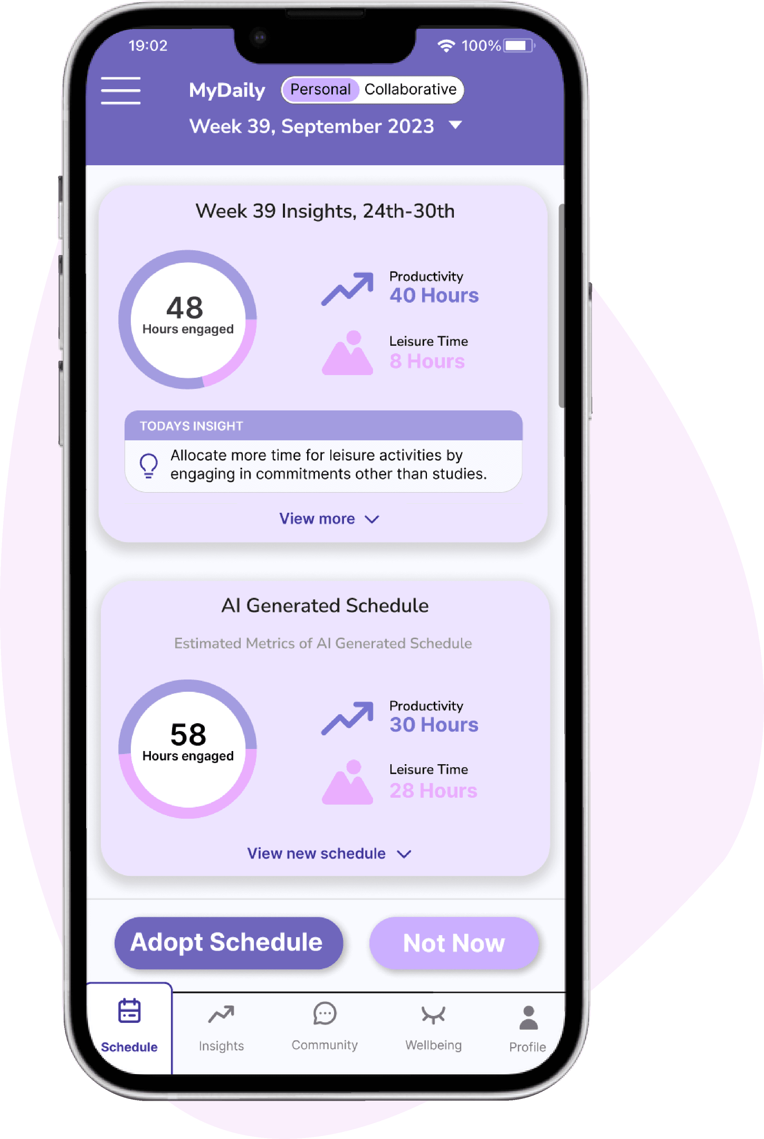
Optimize schedules with the built-in AI optimization tool.
Lifestyle Insights
Provides students with a visual breakdown of different aspects of their schedule.
Provides students with insights into their current calendar to nudge positive lifestyle habits.
Managing Stress
Allows students to connect to their smartwatch to monitor stress levels.
Provides de-stressing tools for student well-being based on stress assessment.
Fostering Accountability
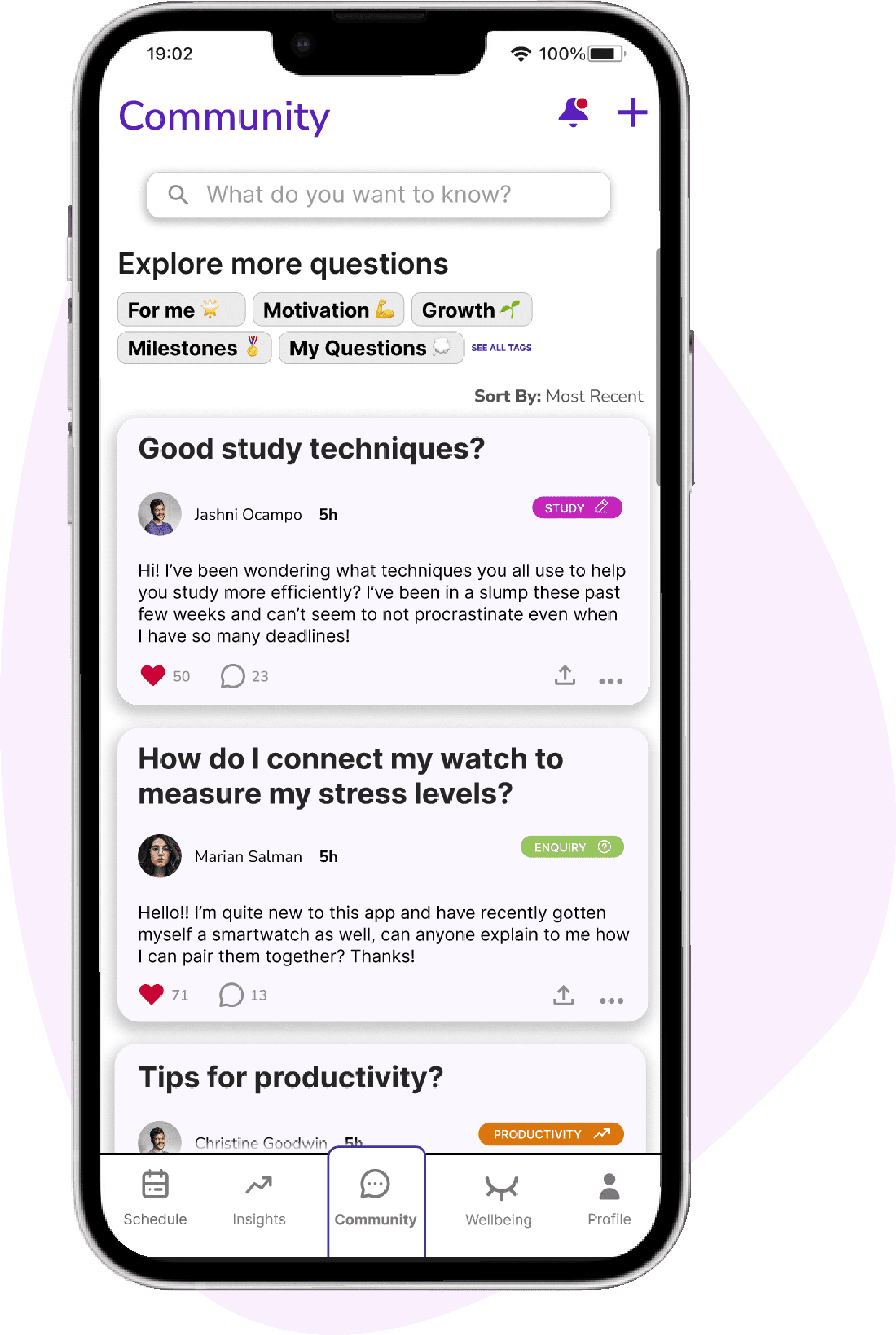
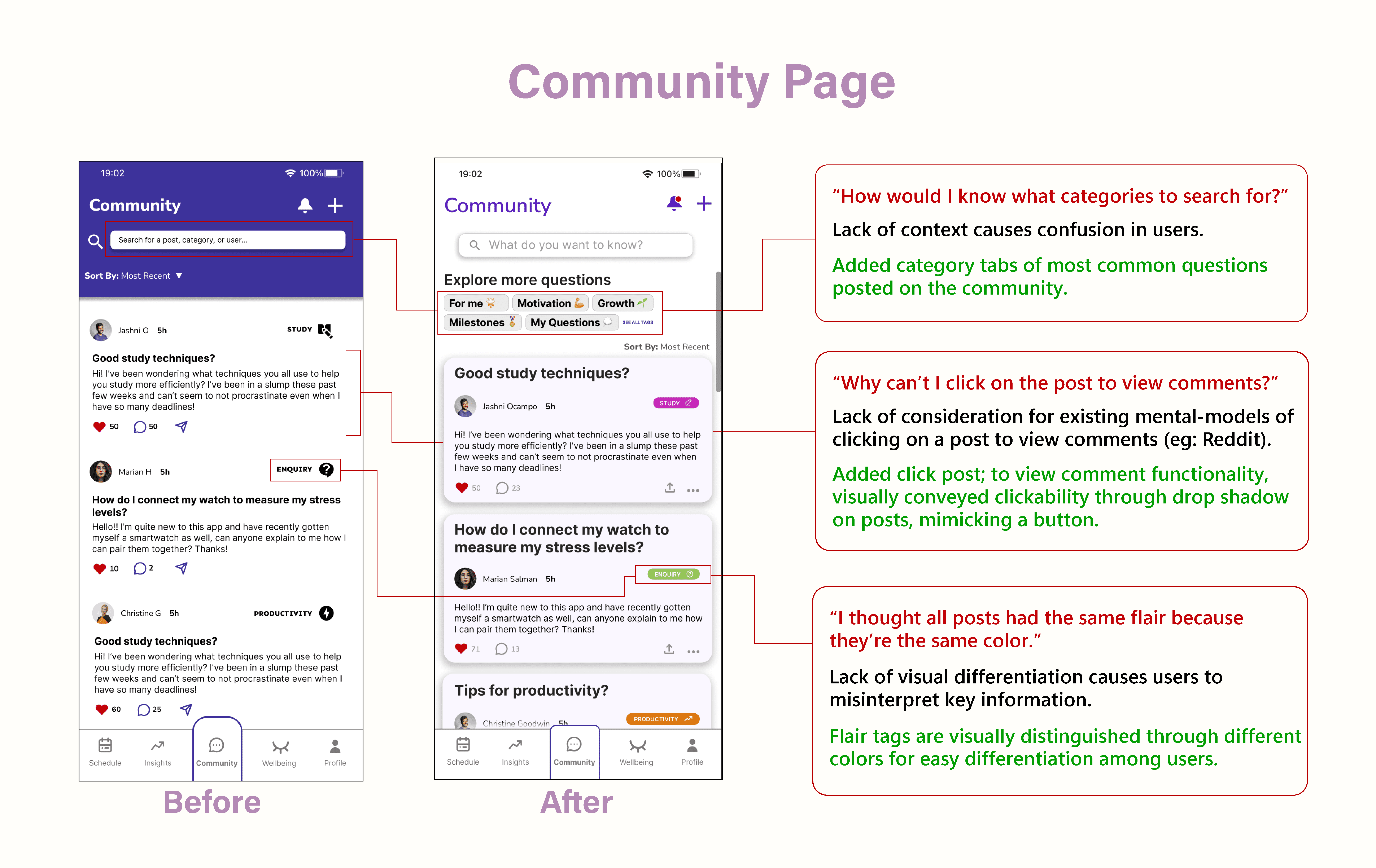
Allows students to post inquiries, and also search up existing inquiries.
Serves as a platform where students can support each other in staying accountable in maintaining a balanced lifestyle.
Connects to a profile page where students can keep track of their post activity.
OUR APPROACH
RESEARCH
WHITE PAPER RESEARCH
A way to lead a balanced, stress free lifestyle…
Context
People lead an unbalanced lifestyle due to work commitments and no social support.
Another exacerbating factor was the lack of awareness regarding the impact of leading an unbalanced lifestyle (Walsh, 2011).
Demographic
Target demographic : 18 - 25 year olds (University students).
The need to balance academic demands, personal life, and work responsibilities are the main contributors to student burnout (Lawton, 2019).
COMPETITIVE ANALYSIS + THE GAP
NONE of the competition had integrated habit tracking and wellbeing tools.
While keeping the above research in mind, we analyzed the three most popular apps surrounding the schedule management space. We found that very few apps focused on goal setting, and none of them integrated habit tracking and wellbeing tools.
This indicated a big gap in the market and highlighted the need for a centralized application that allows students to manage their schedule and also de-stress.
PROBLEM STATEMENT
Once we had an initial understanding of our problem space, we developed a problem statement and made sure that the statement was broad enough to allow for exploration. This served as the starting point for our primary research.
ONLINE QUESTIONNAIRES
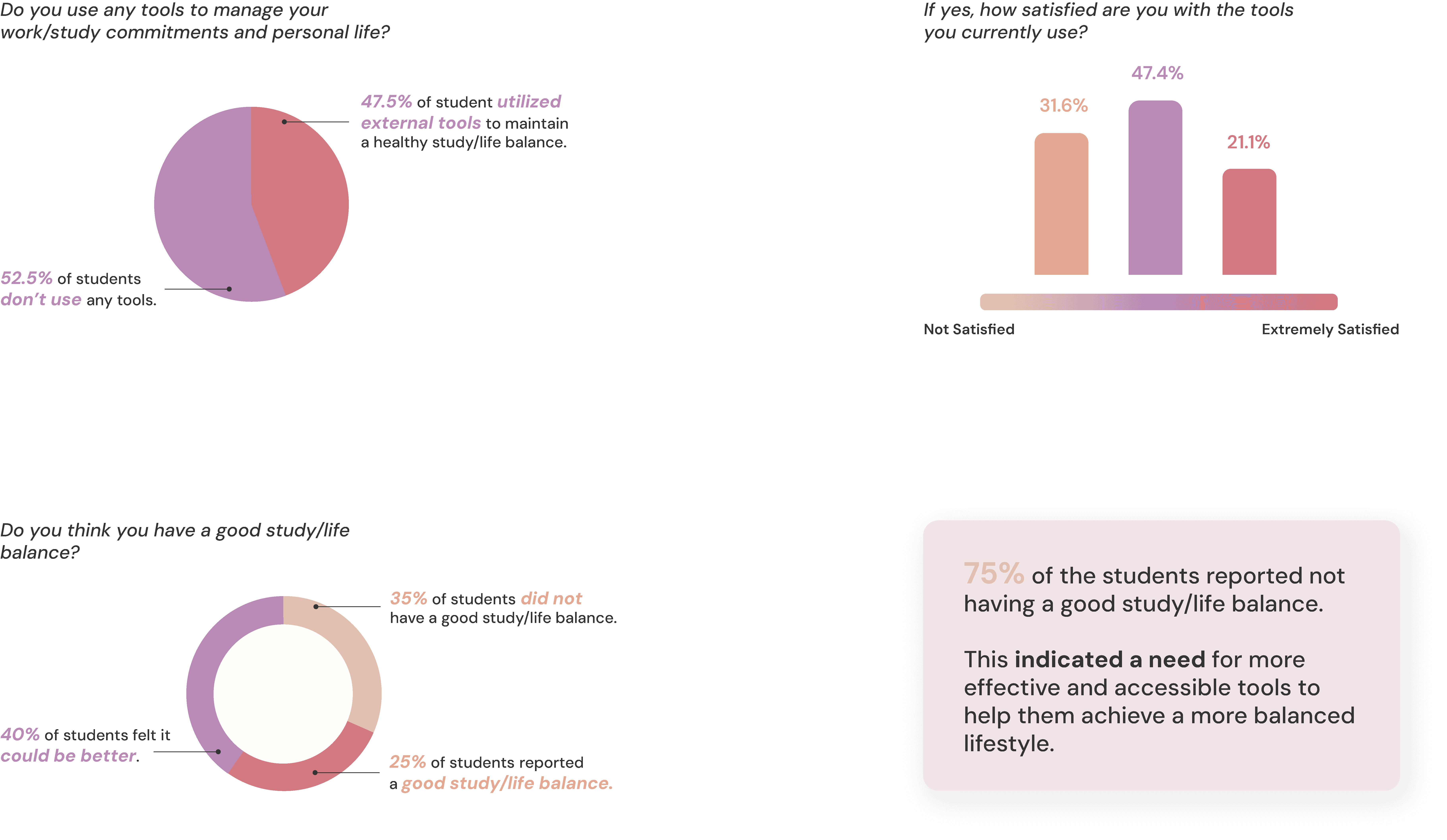
75% of our respondents admitted to not having a good study/life balance.
We started our primary research with online questionnaires to collect quantitative data exploring the study/life balance, and stress levels amongst university students. We received 40 responses.
Link to responses.
USER INTERVIEWS
A total of 10 semi-structured interviews were conducted, involving Australian university students. This was done to obtain context-specific insights (Flick et al., 2004). The interviews helped us validate our survey findings, explore daily routines of university students, and probe deeper into the effectiveness of current scheduling tools.
DAIRY STUDIES
Dairy studies allowed us to compare lifestyles between full-time employees and university students. By encouraging participants to record their daily experiences "in the wild," we were able to closely examine their daily routines, explore the leisure activities they engage in, and also their work or study commitments.
SUMMARY OF FINDINGS FROM INTERVIEWS AND DAIRY STUDY
Workload intimidation and unbalanced lifestyle are the leading causes of mental health issues.
DATA SYNTHESIS
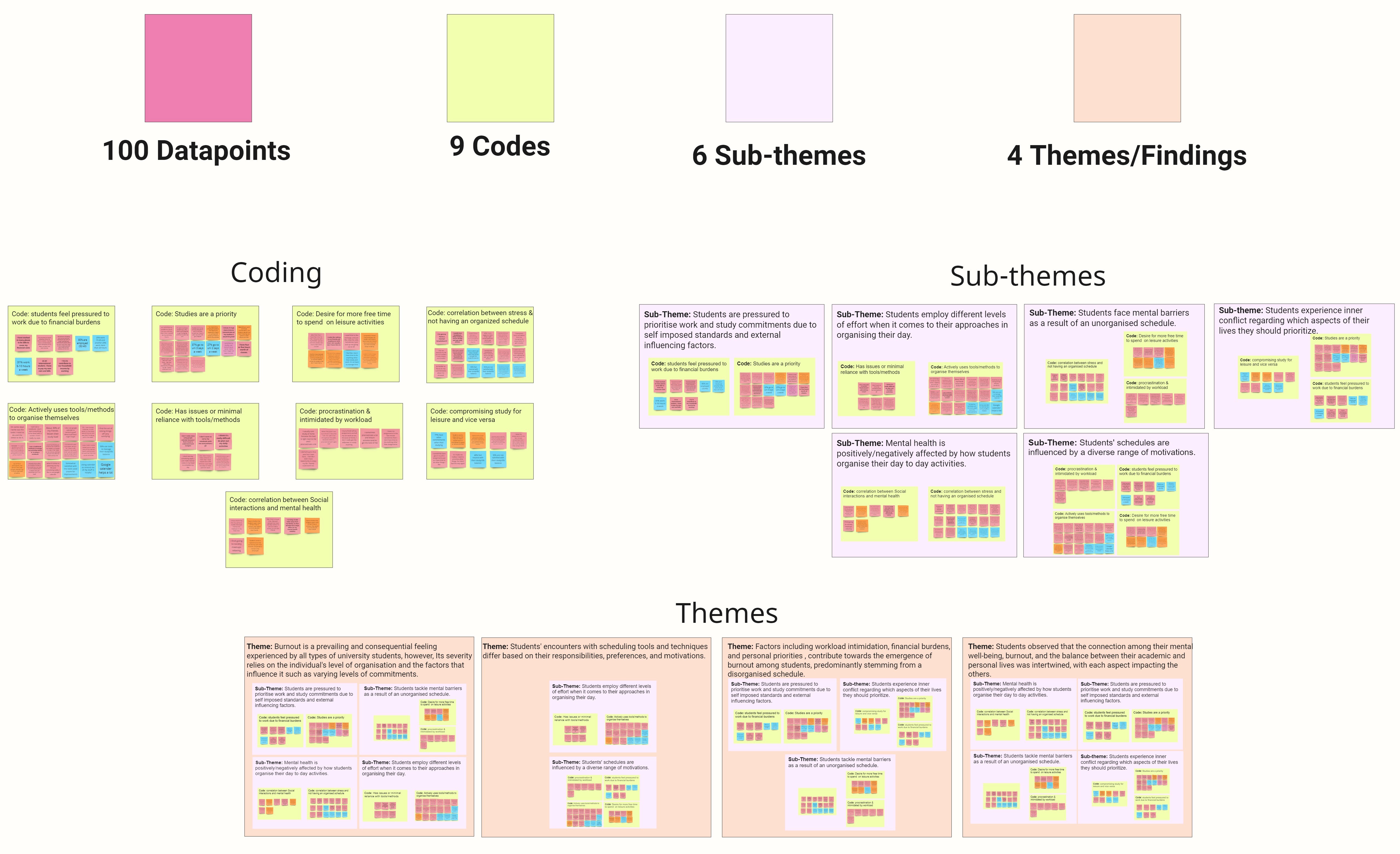
We conducted a thematic analysis to synthesize our findings from the questionnaires, interviews, and diary studies. A bottom up analysis of the data was done to identify trends that appeared from similar clusters of data.
INSIGHTS
Following our thematic analysis, we identified four core themes within our data. These themes were subsequently converted into actionable insights, with each insight addressing a specific research question.
Direct correlation between level of self organization and mental health
REFINING THE PROBLEM
After synthesizing our findings and converting them into insights, We revised our initial problem statement to better align with the problem area (Schicker, 2022).
PERSONAS & STORYBOARDS
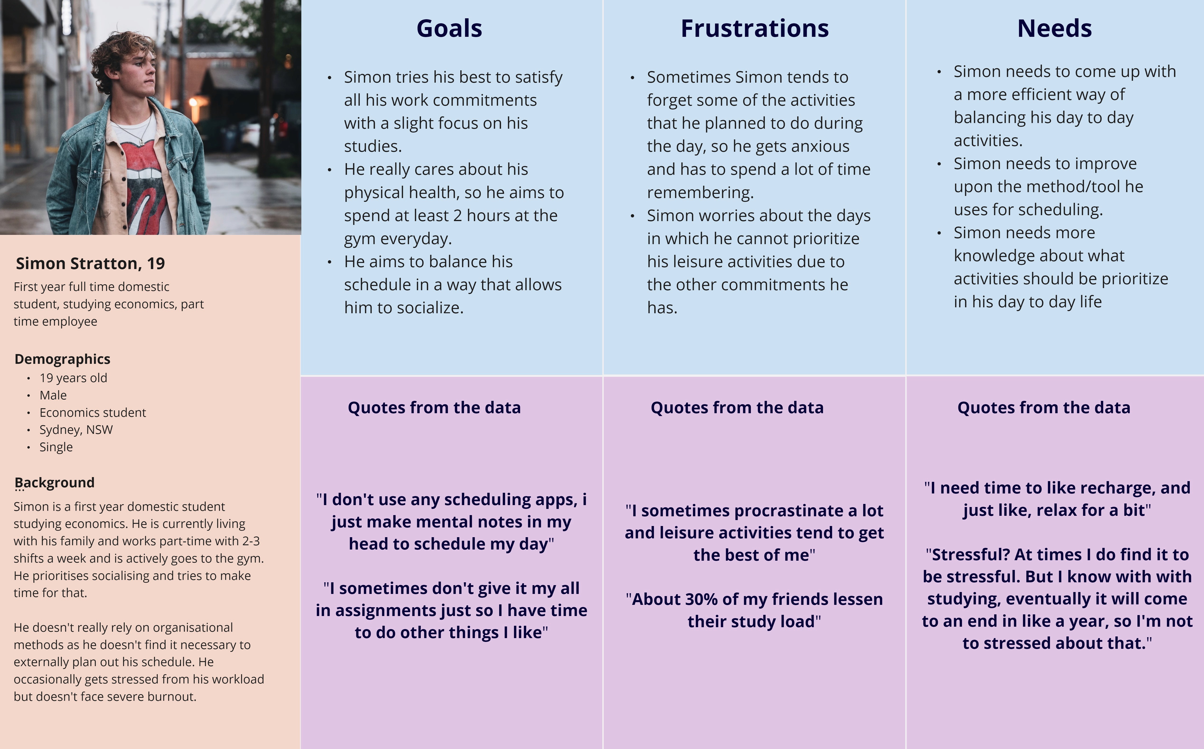
Our research findings were condensed into 3 different personas, each persona representing a university student with varying study/life balances and tolerance to stress.
We also created storyboards for each persona to visually communicate how they would navigate a "day in their life". This allowed for a deeper understanding of the different situations, feelings, and contexts our target demographic would engage with (Van Der Lelie, 2005).
CONCEPT IDEATION
Once we refined our scope and analyzed our data, we started to ideate design solutions that collectively addressed our research findings and gaps found through secondary/market research. We came up with three divergent design ideas that tackled our problem space.
Design Idea 1
• Smartwatch and app based …concept.
• Schedule and stress ...management.
Design Idea 2
• Interactive whiteboard and ...app.
• Focused on collaborative
…scheduling.
Design Idea 3
• AI based scheduling app.
• Well-being tool integration.
• Event sharing capabilities.
DECISION MATRIX
Evaluating our concepts
We used a decision matrix to evaluate our design concepts. The criteria for this decision matrix was determined based on our target audiences, and research findings from our analysis. We also considered multimodality, social interactions, and the 3 Cs (Coordination, Collaboration, Communication).
We decided to focus on Design Idea 3 as it was the most well rounded, and consistent idea, scoring in the high 4-5 range under each criteria. However, this idea did not score well under the collaboration criteria. We therefore decided to adopt the collaborative scheduling feature from Design Idea 2 and this ultimately resulted in a final concept that was well rounded and addressed all our research findings.
SOLUTION
The omni-channel solution
Mobile app
A self-organization tool that helps university students balance their study and personal life schedules. Provides de-stressing tools, assesses study-life balance, and includes a community forum to foster accountability and motivation.
Desktop app
Users are able to create and share events on desktop and tablet devices, allowing them to manage events on larger screens. Another added functionality is the ability for users to manually write or draw event descriptions using a stylus, catering to those who prefer a more tangible approach to
self-organization.
Smartwatch integration
Users are able to connect to a smartwatch through our app and measure their stress levels. Our app then provides de-stressing tools and general well-being insights.
SKETCHING AND WIREFRAMES
After finalizing our design concept, We sketched out our prototypes which were then converted into low fidelity static wireframes. High-fidelity mockups and prototypes were developed in later iterations; and subsequently tested at every stage.
TESTING + IMPROVEMENTS
User Testing Methods
Heuristic Evaluation
Heuristic Evaluation
Cognitive Walkthrough
Loop 11 Unmoderated Testing
SUS Survey
Once we iterated upon our initial sketches and designed wireframes, we started to test the usability of our wireframes through user-testing. Using a mix of 'Expert' and 'User' testing methods allowed us to leverage the expertise of peers to assess design principles while also incorporating feedback from actual users.
ITERATION 2
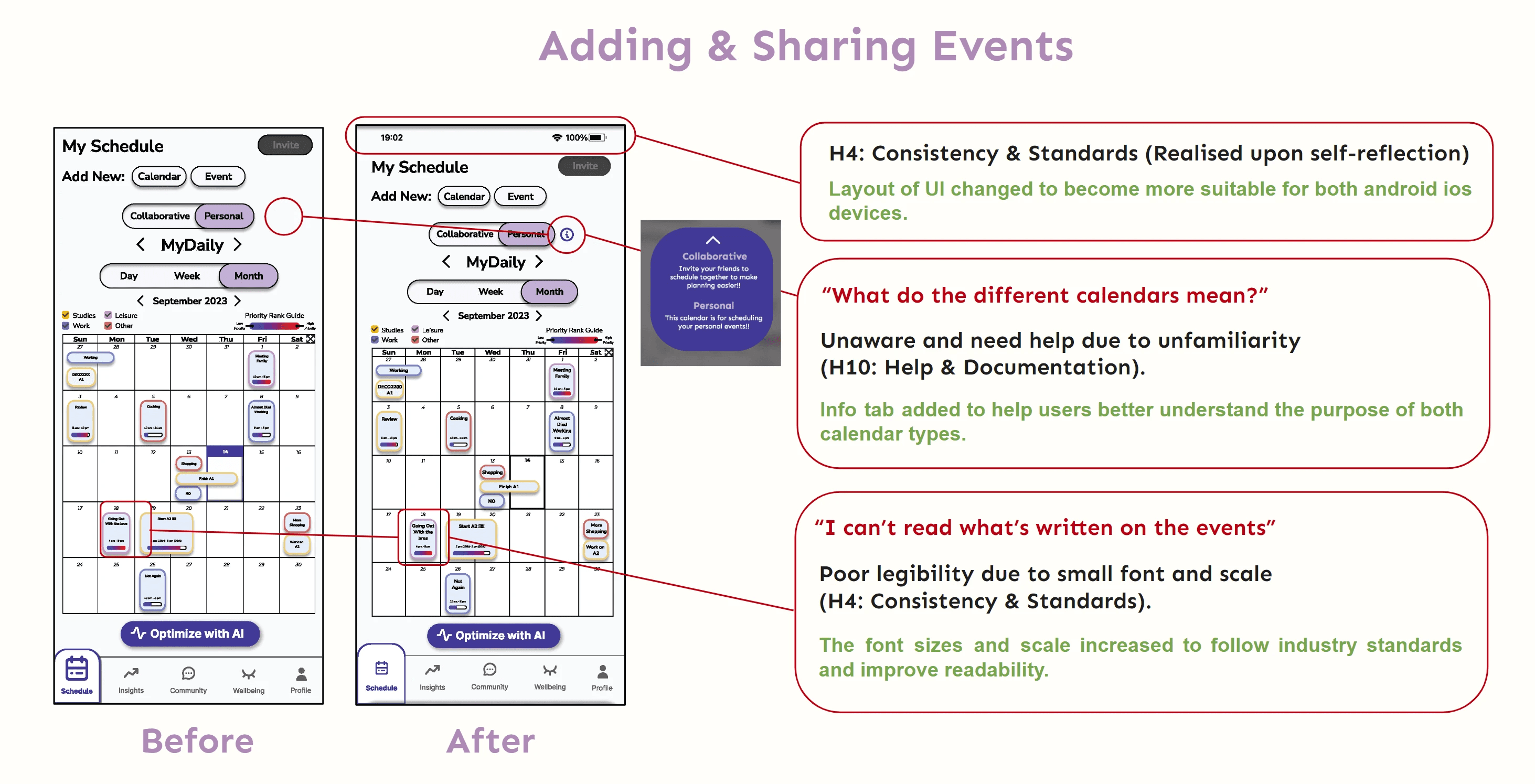
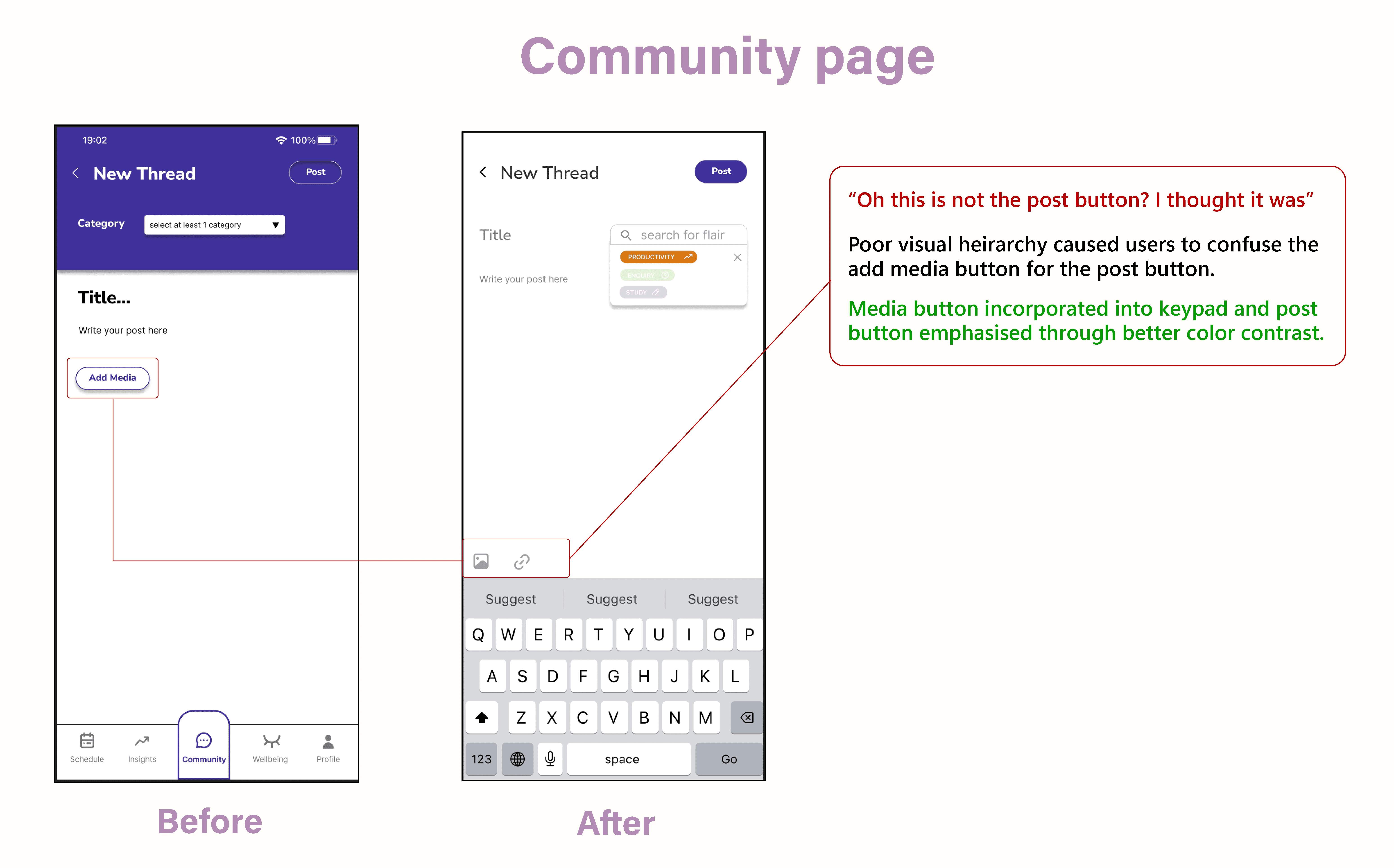
Pain points from user testing are quoted below along with the issue and solution implemented (Note - Only major changes between iterations are shown below).
Testing Method
Cognitive Walkthroughs - 3 sessions.
Think Aloud Protocol & SUS Survey - 6 sessions .
6 tasks to be completed.
Key Findings
Improve button size and placement for better visibility.
Include visual indicators to inform users of the function of less obvious features
Place relevant options closer to each other for better discoverability.
Have multiple options to navigate to the same result for convenience.
Simpler options and functions are better understood as they give the user less to think about.
ITERATION 3
Testing Method
Heuristic Evaluation - 3 expert testing sessions .
6 experts in total (3 sessions - 2 features each).
Average time per session - 1h 40m.
Key Findings
Added an info icon next to collaborate/personal tabs.
Users found the wellbeing page to be un-engaging.
Included an onboarding screen explaining locking events.
Simplified the layout of the community page to avoid information overload.
Changed font sizes and iconography to fit industry standards.
ITERATION 4
Testing Method
Tested by 17 users
Think Aloud Protocol + Loop 11
Average time per session : 11 minutes.
All sessions were monitored and conducted remotely.
Key Findings
Made intended features more obvious - had consistent visual hierarchy to improve legibility.
Included infographics and icons where required for greater user engagement and comprehension.
HIGH-FIDELITY RE-DESIGN
ITERATION 5
One final round of testing and improvements
Testing Method
Think Aloud Protocol
Tested with 6 users.
Key Findings
Improved color palette to be more inviting and visually appealing.
Included icons and descriptors when necessary (reword)
Improved the general aesthetics of the UI to be more modern and visually appealing.


